When you purchase beauty products, being aware of their ingredients and storage requirements matters. This is where the small icons printed on the back become useful.
Unfortunately, these markings are not merely decorative and can sometimes be confusing. While countless symbols appear on beauty items, we’ll focus on six frequently encountered ones to help you get started on decoding your products.
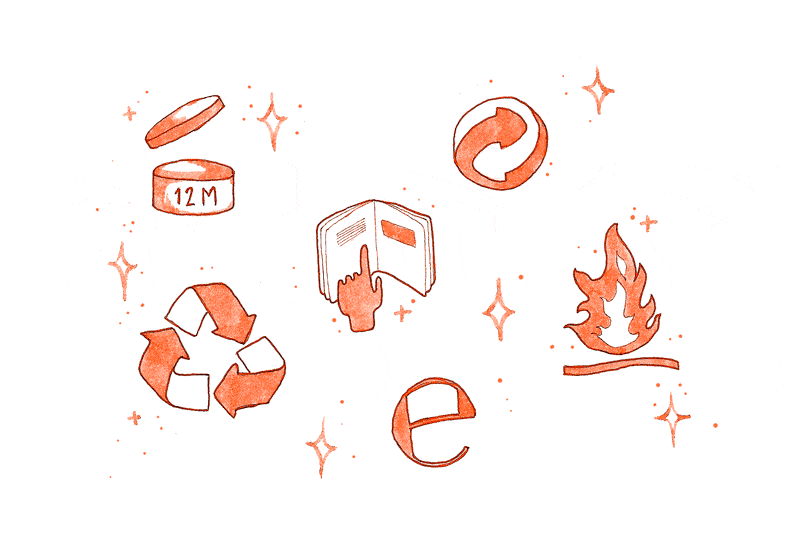
Shelf Life After Unsealing
This icon tells you the duration a product remains usable once it's been opened. The letter 'M' represents the months it stays effective. Certain Korean brands feature a space where you can note the opening date, allowing you to track when to discard it. Unfortunately, no product lasts indefinitely.
When the expiry date arrives, you may be reluctant to toss it out, thinking, 'It cost a lot!' But in reality, the item is no longer viable. Its effectiveness declines, and in extreme cases, it could harm your skin. Personally, sheet masks are the products I often overlook and they end up spoiling. Examine your collection and discard anything past its prime.
E-Mark for Volume Verification
Referred to as the e-mark, this icon is typically seen on items packaged within Europe. It confirms that the average amount of product does not fall short of the volume stated on the label.
Information Leaflet Indicator
Contrary to what it might suggest, this icon doesn't mean 'read more'—though reading is always beneficial (books are great companions). It signifies that the product comes with an insert detailing how to use, store, and what ingredients it contains. Smaller packages frequently bear this symbol.
Keep in mind: never discard these leaflets because reviewing product information is always wise. If you have delicate skin or are prone to allergies, examining the ingredient list should already be a routine. Understanding correct usage ensures you achieve optimal benefits.
Flammability Warning
This ranks among the most critical icons here, as it warns that the item is extremely flammable. Fortunately, its meaning is fairly obvious, and I trust no one would mistake it as an invitation to toss the product into a campfire!
Store any flammable items away from direct sunlight and open flames. Many people place scented candles on their vanity—keep these items apart!
The Green Dot Logo
Typically appearing in green-and-white or black-and-white, this icon is known as the Green Dot. It can also be found in other hues to complement the package design—like the version used on this blog. Frequently mistaken for a recycling symbol, this mark actually signifies that the manufacturer contributes financially to the sorting, recovery, and recycling of packaging materials.
Interesting tidbit: This logo originated in Germany, where it is called 'Der Grüne Punkt.' When I first heard that name, I pictured an environmentally conscious German punk rock band—something that would be awesome if it were real.
Mobius Loop Recycling Symbol
One of the most familiar icons, and fortunately present on numerous items, is the Three Chasing Arrows, also called the 'Mobius Loop.' It indicates that the packaging is recyclable and reusable. Whether the product itself consists of recycled material depends on the number inside the symbol, which denotes the percentage of recycled content. Below are the numerical codes and their meanings:
Recyclable: 1 PETE and 2 HDPE. Sometimes recyclable: 4 LDPE and 5 PP. Reusable: 2 HDPE, 3 PVC, 4 LDPE, and 5 PP. Avoid if possible: 6 PS and 7 OTHER.
Another interesting fact: this symbol shares a German link with the Green Dot. Created in the 1970s by a Californian designer, it was greatly influenced by the Bauhaus movement (1920s-1930s), which originated in Germany.
Does she adore or neglect? The way he holds your hand reveals his true attitude!