Not every trend has the same lifespan. Occasionally, refined taste prevails, turning a classic into a trend. Consider subway tile: it has been highly fashionable lately, yet it won't feel outdated soon. Its simplicity, versatility, and beauty guarantee lasting appeal.
Terracotta has recently surfaced everywhere—from fashion runways to interior design. After an overload of browns and earthy shades during the Tuscan trend, many are hesitant to embrace a warm, dusty orange that borders on brown.
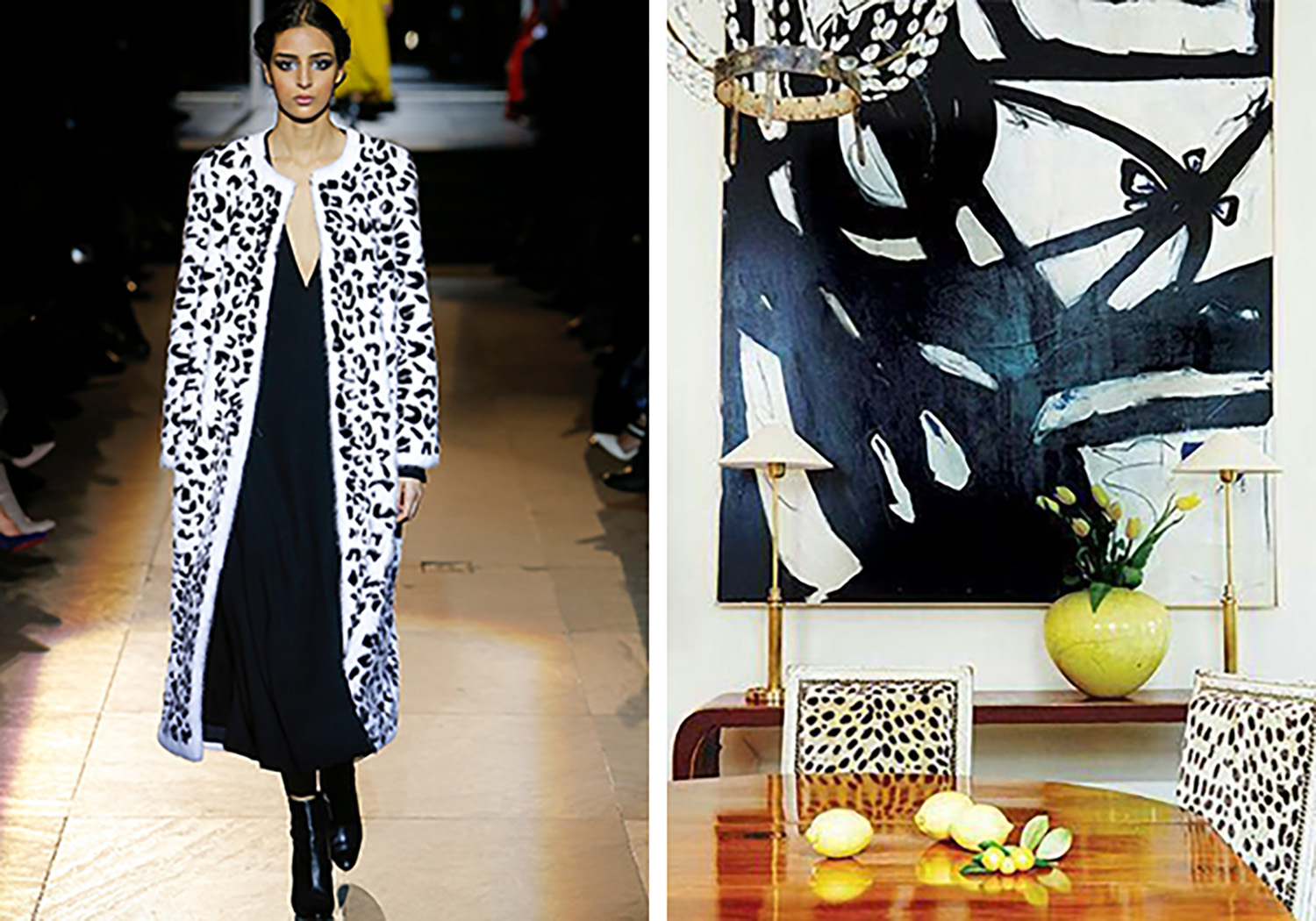
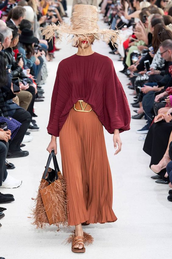
Valentino's 2019 spring/summer collection, as featured in British Vogue.
However, terracotta is more than a color; it's a material with a rich architectural heritage. It can be considered a classic.
The warm, spicy shade of baked terracotta evokes the beautiful patina of garden planters, terraces, and Mediterranean buildings—a material as timeless as brick or wood.
For many, this color recalls the 1990s, when it was popular alongside other warm earth tones like gold, burgundy, pumpkin, and sage.
To keep terracotta looking contemporary rather than outdated, pair it generously with fresh white, greige, cream, pale beige, or gray.
This dusty orange seems to be a response to the predominance of white and gray in recent interiors. Just as oak and rattan have gained popularity, terracotta—in both color and material form—is emerging as a favorite because it beautifully contrasts cooler schemes, much like cognac leather or warm wood.
Terracotta details adding warmth to a contemporary gray wood floor (Source).
Terracotta functions as a bold, warm neutral, which adds to its versatility. Though its undertone is orange, it is saturated enough to be seen as a color rather than a neutral—depending on your definition. It is gentler than pure orange yet more vibrant than brown.
Which neutrals complement terracotta? Off-white, cream, greige, green-gray, green-beige, taupe, and occasionally blue-gray or violet-gray. Be cautious with pink-beige, yellow-beige, and gold-beige. Terracotta has a strong pink-orange character; if it leans yellow, pink-beige may clash, while if it leans pink, yellow or gold beige might not work. Overall, it is quite adaptable.
Combining terracotta with heavy olive green and brown can make a space feel dated, but introducing just a touch of this warm shade into an otherwise light room creates a lovely effect.
Let's explore the various ways to incorporate terracotta into your spaces.
Using Terracotta as an Accent
As an accent color in furniture, fabrics, and decorative items, terracotta works well when balanced with plenty of fresh white and touches of black or dark blue. It also pairs nicely with leafy greens.
Featured in House Beautiful.
Applying Terracotta as a Wall Paint
Sherwin-Williams introduced Cavern Clay as its 2018 Color of the Year, encouraging homeowners to pick up their rollers. While it could add warmth to a small, cozy space like a powder room or study, using it on walls demands thoughtful decoration and can easily overwhelm. It is unlikely to serve as a main wall color in an open-concept home.
However, it appears stunning on the wall in the following vignette, combined with soft black and cream.
Source.
House & Home.
It's also clever how they extended the terracotta floor color partway up the wall for a custom effect, accented with soft pink. This demonstrates another reason terracotta is trending: it complements the popular blush pinks and apricots. A deeper shade of terracotta provides grounding and depth, preventing a pink palette from becoming overly saccharine.
I am currently deciding on a reupholstery color for my vintage sofa, and a faded terracotta or apricot shade is a strong contender. It is simply lovely.
Apricot velvet sample being considered for my sofa.
Terracotta as a Building Material
In a classic pave-style floor, terracotta or saltillo tiles are timeless when used in the appropriate setting. They naturally suit Spanish-style homes, as seen below.
Source.
My browser is set to French, making it a bit challenging to search for a French term in an English context! However, if I'm not mistaken, a pave tile floor has the rustic appearance of outdoor pavers.
Terracotta and saltillo rank among the most attractive options for this style, alongside creamy limestone. Such floors are an inspired choice for linking indoor and outdoor spaces—for instance, a kitchen with garden doors, a mudroom, or a sunroom, as in the subtle, rustic room below.
House & Home.
Like wood flooring, terracotta is fairly neutral, but it helps to echo its warmth in furnishings and decor—perhaps with warmer wood tones or peach and blush accents.
Terracotta tiles come in shades from pale orange-beige or peach to deep mahogany, allowing for either an airy or rich aesthetic. The lighter tones tend to feel fresher and more modern. As with wood, a natural matte finish appears more contemporary than a high-gloss one.
This tile style imparts a rustic character, if desired. It warms up a white or cream kitchen similarly to a classic hardwood floor, as demonstrated in the kitchen below, which also connects the interior to the garden.
Source.
Brit & Co.
The terracotta floor pictured above appears timeless, beautifully complemented by a soft cream and blush palette.
— Also read: Jamie Lee Curtis Calls High-End Skincare a Money-Making Scam.
However, outside a Mediterranean-style home or garden setting, proceed cautiously. Terracotta floors can feel out of place in a contemporary space or a high-rise condo without a ground connection. But if your home suits this style and you live in a warm climate where hardwood is impractical, it's worth considering. If you already have such floors and are debating removal, I hope I've offered ideas to make them work, allowing you to allocate your budget to the enjoyable part—decorating!
For those without such floors, a great way to embrace the trend is to use terracotta as an accent or in a powder room—a cozy option for the colder months ahead.
I will update you on my sofa reupholstery decision.
Are you currently drawn to this color? Are you considering or already using terracotta tiles? Do you see it as classic or trendy? We welcome your opinions.
Thank you, Tricia! Here is a photo from my Dallas class last week.
There is still time to join my last fall course in Vancouver, taking place November 28–20.
This article was authored by my Senior Colour Designer, Tricia Firmaniuk. I am currently in Charleston wrapping up my 'Specify Colour with Confidence' workshop with 29 wonderful women. Interestingly, last week in Dallas, the gray trend had already ended in some areas. Unsurprisingly, warm hues like the one Tricia discusses are gaining popularity—read on for the details!
The Length of Your Finger Reveals Your Personality