By Mandi Johnson
While browsing online listings, I scrolled past countless houses—some were appealing but needed extensive work, others were flawless yet far beyond my budget. Out of sheer frustration, I clicked on a peculiar 1980s property I had previously ignored. To my surprise, my mind began racing with possibilities. I was captivated, envisioning all the modifications I could make with relative ease. Intrigued, I scheduled a viewing for the following day.
After touring the property, we were amazed at how well it accommodated our family's unique requirements. We submitted an offer, and once it was accepted, I returned to take measurements for AutoCAD. Yes, I am that obsessive person who had detailed scale drawings and budget spreadsheets prepared before the closing! I thought it would be enjoyable to share the original kitchen sketch I created then, and if you're interested, you can find more about my kitchen planning and progress on my blog at these links: here, here, here, and here.
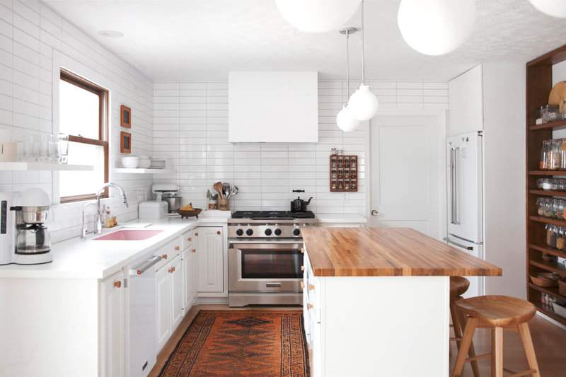
Remarkably, very few elements deviated from the concepts that first came to mind when I saw the house online. To stay within budget, I aimed to salvage as much of the existing kitchen as possible. Since I disliked the oak raised-panel cabinets, painting them white would let them recede into the background rather than dominate the design. I also wanted to open up the space, so I eliminated all upper cabinets, replacing them with a single row of open shelves. Storage was not an issue—there were plenty of cabinets in the island and under the counters (the corner lazy Susan is fantastic!). The cabinet I constructed above the refrigerator, along with the large shelving wall, provided the remaining storage. (And there's a pantry closet hidden behind the shelving wall.)
Since most of the kitchen would be white, I wanted to incorporate plenty of textural interest without clutter. The wide blank wall above the cabinets was the perfect spot for texture! I covered it entirely with large subway tiles arranged in a stackbond pattern for a more contemporary look than standard white subway tile. I deliberated over grout color and am thrilled with TEC Silverado grout, which adds definition between tiles without excessive contrast. The open shelving also contributes texture. Everything on the shelves is white or glass, so the shelving avoids clutter while still providing visual interest. All that clean white is balanced with rustic wood elements, such as the large shelving wall I built and a vintage spice rack that echoes the shelving wall's style. A wooden butcherblock countertop from Lumber Liquidators, wooden cabinet knobs, wooden stools, and wicker baskets all add warmth, offsetting the stark coolness of white.
On the very day we closed on the house, Phil and I began demolition! I pulled up all the carpet on the first floor, and for a date night, Phil and I broke out and removed all the tile from the kitchen and hallway. How romantic! Then my dad helped remove the old countertop and disassemble the cabinets. We rearranged them to move the stove to a different wall, creating more space for a main dining area in the eat-in kitchen. (We're using the formal dining room as a playroom.)
Once everything was cleared out and the cabinets were positioned, rebuilding was incredibly exciting! My favorite solo project was the shelving wall. I might add some rustic doors to parts of it in the future, but I love having easy access to dry goods and snacks. Plus, let's be honest—I enjoy stuff, and these shelves let me rearrange my belongings in fun ways with each season.
The most thrilling day of the rebuild was when my new stove was installed! I had only dreamed of owning such a beauty—six burners, dual-heat steam oven… forget about it. I love all our new appliances, but this stove makes it easier to get out of bed in the morning. (Especially if I have ingredients for pancakes, bacon, and eggs in the fridge!) I still pinch myself every day I get to use this bad boy. I'm also glad we moved its location to this other wall. Our old stove was electric, so we had to run gas lines anyway—we might as well move the stove to a more convenient spot. Rerouting the exhaust vent wasn't difficult because the ceiling joists happened to run parallel with the stove wall. We sealed the hole from the old vent with ventilation, covered it inside with drywall and tile, and covered the exterior hole with a metal plate and silicone until we can patch the siding.
People often ask about the jars I use for food storage. They are Le Parfait brand, available online in many places, but I've also found them at discount home stores like Marshalls and HomeGoods. I used to label every jar, but now I only label those that are easily confused. (Once I tried to make frosting using baking soda instead of powdered sugar!) I frequently consolidate contents from a nearly empty jar into a smaller one to free up the large jars, so items get shuffled around and labels become annoying in that case.
My daughters and I start every morning at the kitchen island. I sip coffee and answer their wild questions while they usually eat eggs and toast or fruit and yogurt. We often have lunch at the counter too, but dinners take place at the round antique table I snagged on Craigslist. It has three leaves, so we can expand it for hosting friends and family, but most days it stays small like this.
I carried the traditional-rustic-meets-minimal-modern vibe into the dining area, where I use the antique table alongside these elegant Lippa chairs from LexMod. The vintage booster seat adds the perfect blend of old and new.
I was absolutely thrilled when I found this beautiful chandelier from Hinkley Lighting, because it perfectly combines several styles I adore: Bauhaus-inspired shiny chrome, funky 1970s curves and globe shapes, and understated elegance with a traditional feel. Oh, and the clincher was that matching pendants were available, perfectly sized for our kitchen island!
I can't believe I've gotten this far without mentioning my pink sink. I chose most materials because they were inexpensive and safe enough that I knew I'd be happy with them for years. But I had to have a little fun somewhere! That's where the pink sink comes in. This is an acrylic sink by Thermocast, undermounted beneath our white Corian counters for the perfect pop of pink. I use a tray in the bottom of the sink to prevent scratches and also to conveniently rinse dishes when things pile up. With all the new materials, I hadn't realized how worn our old outlets and switches looked until I saw them next to the fresh white walls and tile. Ugh. Details matter! So we installed new paddle switches, universal dimmers, and outlets from the Legrand Radiant line. The screwless wall plates are the perfect finishing touch, fading into the background and letting my design choices shine. We also installed outlets with built-in nightlights in our halls and pathways, making it easy to sneak into the kitchen for midnight snacks!
Choosing a shade of white for our walls was a bit stressful (even though I wrote an entire blog post about selecting white paint!), but I'm happy with Benjamin Moore's Super White in our kitchen. It's a particularly tricky space because there are many white elements I can't control the shade of, like our KitchenAid appliances, the dining chairs, the tiles, and to some extent, the countertops. Super White turned out to be the perfect neutral white for this environment (neither cool nor warm), feeling very bright but not as stark as untinted white would. It feels bright, crisp, and modern—perfectly at peace with the other white elements in the kitchen.
For those interested in my earlier posts detailing the kitchen planning and process, I've compiled them below. Additionally, you'll find a list of products and materials I used at the end of this article. Feel free to ask any questions in the comments—I'm happy to discuss.
Thank you for joining me on this journey! This renovation was the largest home improvement project I've ever tackled, and I'm thrilled with how it turned out. I can't wait to begin working on other rooms in our home! –Mandi
Products and Materials Used
Wall paint: Benjamin Moore's Super White; Cabinet paint: Annie Sloan's Pure White (not applied to hood vent or refrigerator cabinet); Wall tile: Home Depot; Tile grout: TEC Silverado; Outlets and switches: Legrand Radiant; Pink sink: Thermocast; Faucet: Kraus from Home Depot; Island butcher block: Lumber Liquidators sealed with Waterlox; Flooring: Lumber Liquidators maple engineered wood; Knobs: eBay; Stove: KitchenAid from Home Depot; Hood vent: Whirlpool from Home Depot with DIY cover; Dishwasher: KitchenAid from Home Depot; Refrigerator: KitchenAid from Home Depot; Coffee maker: KitchenAid; Bar stools: sold out at Target—similar here; Dining chairs: LexMod; Art: Milton Avery reproduction; Round lidded baskets on shelving wall: Xinh & Co; Kitchen radio: TEAC; Lighting: Hinkley Congress collection; Food storage jars: Le Parfait; Bread boxes: Amazon – small and large; Rug, spice rack, utensil crocks, dining table, booster seat, various pottery: vintage